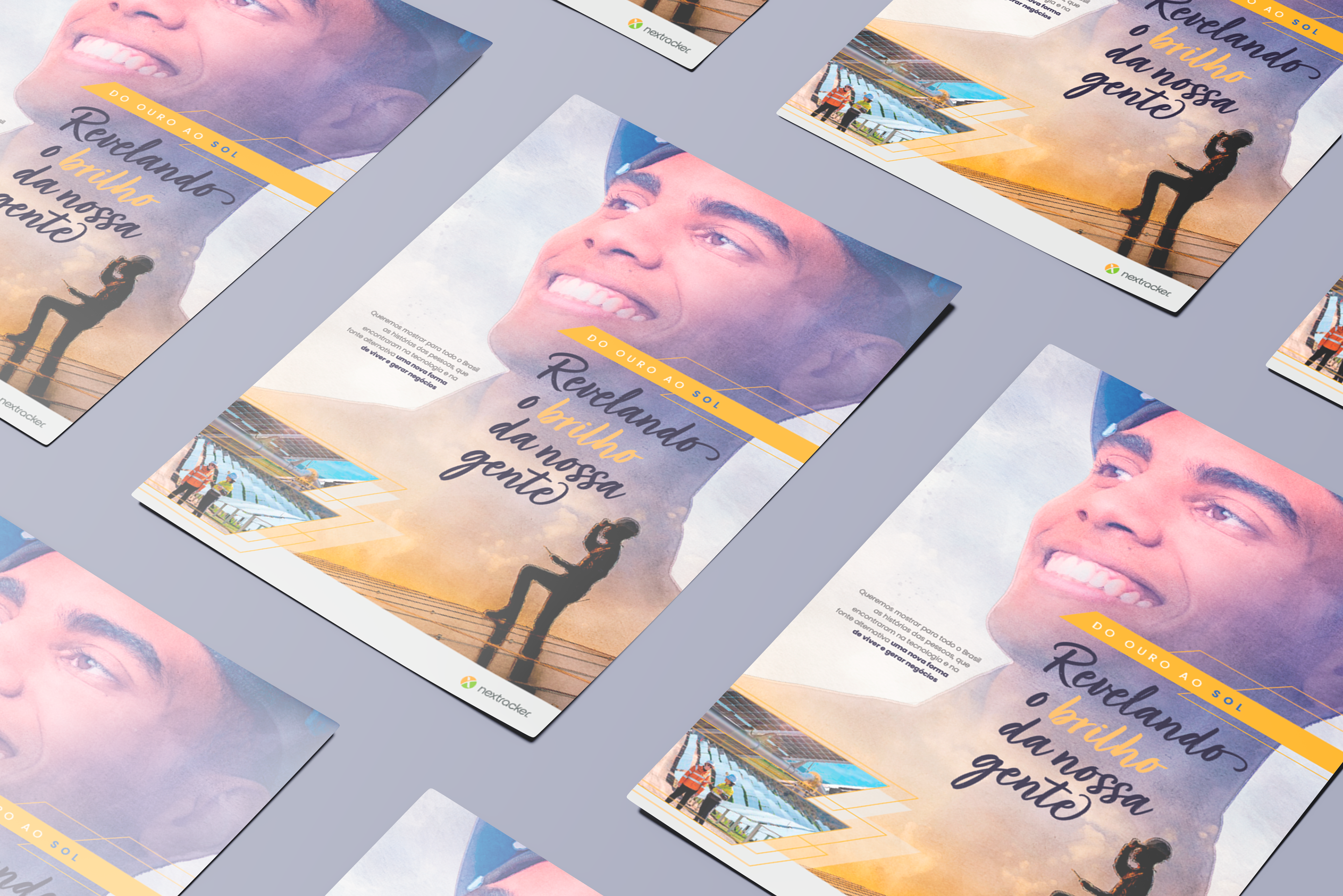
Este Key Visual (KV) desenvolvido para a Nextracker incorpora um design estratégico que equilibra impacto visual e mensagem institucional. O conceito gráfico se apoia na fusão entre a figura humana e a energia solar, transmitindo inovação, progresso e o protagonismo das pessoas na transição energética.
A direção de arte apresenta uma abordagem contemporânea, com influências do duotone e da colagem digital, criando um efeito dinâmico e aspiracional. A sobreposição da imagem do trabalhador com a textura aquarelada reforça a ideia de um futuro sustentável e tecnológico, enquanto os elementos geométricos em linhas e preenchimentos opacos agregam sofisticação ao layout.
This Key Visual (KV) designed for Nextracker embodies a strategic design approach that balances visual impact with institutional messaging. The graphic concept relies on the fusion of the human figure with solar energy, conveying innovation, progress, and the protagonism of individuals in the energy transition.
The art direction embraces a contemporary approach, drawing influences from duotone and digital collage, creating a dynamic and aspirational effect. The overlay of the worker’s image with watercolor textures reinforces the idea of a sustainable and technological future, while geometric elements in outlined and opaque-filled shapes add sophistication to the layout.
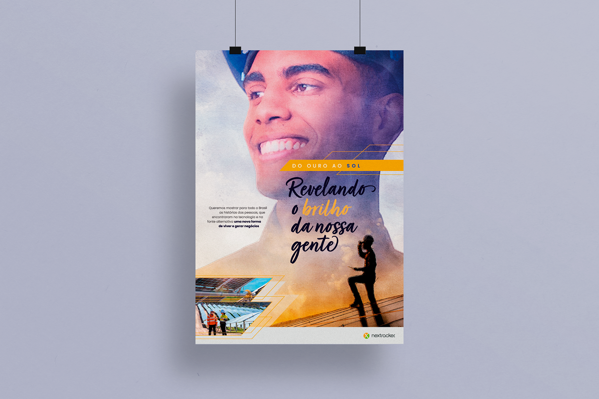
A tipografia mescla uma abordagem moderna e acessível. A escolha de um script caligráfico para "Revelando o brilho da nossa gente" adiciona um toque humano e orgânico, contrastando com a tipografia sans-serif utilizada no corpo de texto e no call to action. Essa combinação tipográfica comunica proximidade e confiabilidade, sem perder a clareza e a legibilidade.
The typography combines a modern yet approachable style. The choice of a handwritten script for "Revelando o brilho da nossa gente" adds a human and organic touch, contrasting with the sans-serif typeface used for the body text and call to action. This typographic combination communicates warmth and reliability without compromising clarity and readability.

O esquema cromático explora tons solares – amarelo e laranja – associados ao conceito de energia limpa e renovável, complementados por azuis e cinzas que reforçam a seriedade e o caráter técnico da marca. A composição geral remete a uma estética editorial refinada, com hierarquia bem definida e espaços negativos bem distribuídos para garantir fluidez na leitura.
The color scheme explores sun-inspired hues – yellow and orange – associated with clean, renewable energy, complemented by blues and grays that reinforce the brand’s technical and trustworthy character. The overall composition resembles an editorial aesthetic with a well-defined hierarchy and well-balanced negative space, ensuring smooth readability.
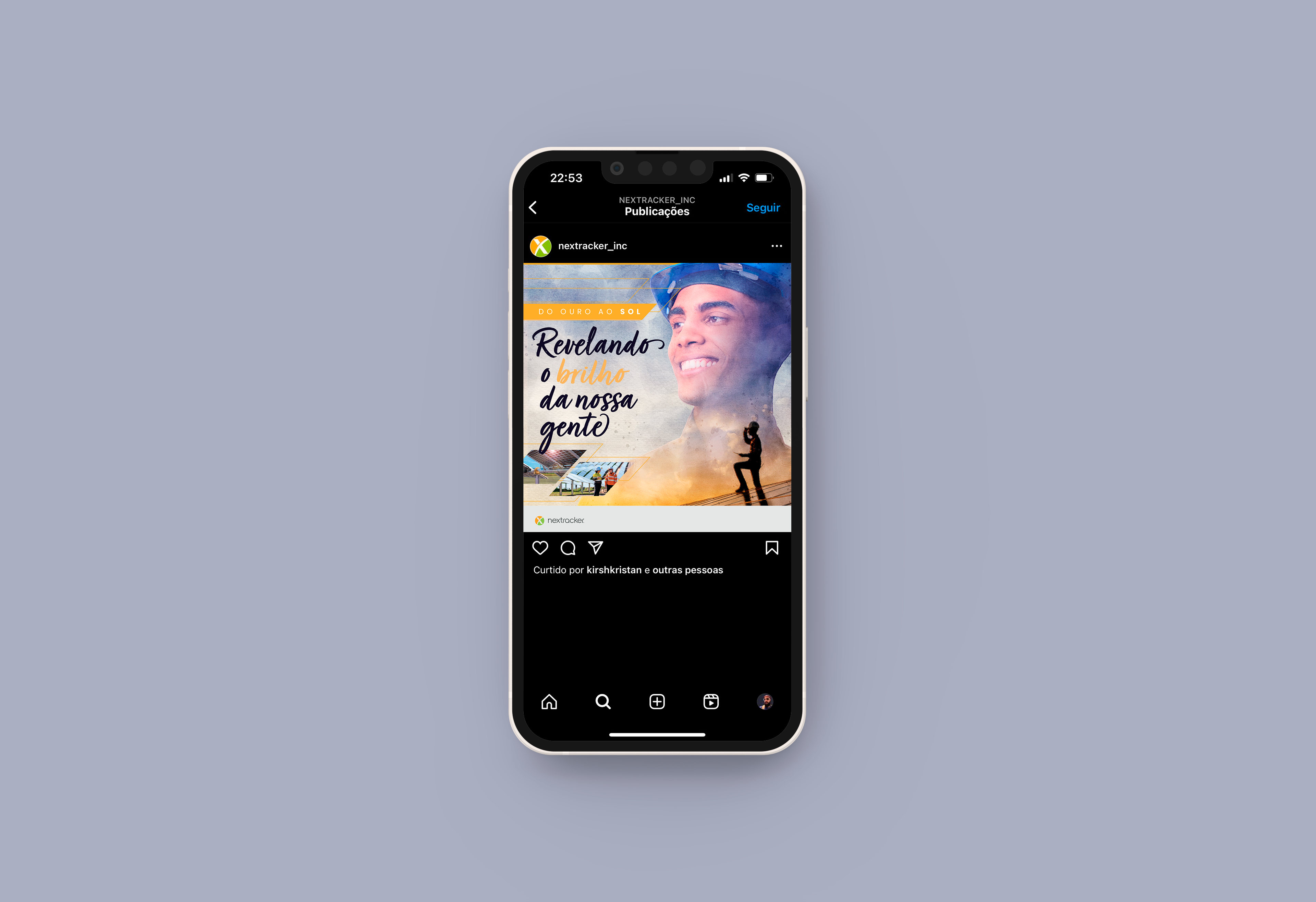
A Nextracker, empresa global especializada em rastreadores solares, tem uma identidade que valoriza tecnologia e inovação, e o KV reflete esses valores ao integrar storytelling visual e design funcional. A mensagem central – a valorização das pessoas no setor energético – é potencializada pelo uso de imagens e tipografia que remetem à confiança, evolução e sustentabilidade.
Nextracker, a global company specializing in solar trackers, has a brand identity that values technology and innovation. The KV reflects these values by integrating visual storytelling and functional design. The central message – highlighting people’s role in the energy sector – is enhanced through imagery and typography that evoke trust, progress, and sustainability.